Designing logos is what I do for a living. So when the boys wanted a name and a mark for the family team, I assumed it would take an afternoon.
It took six versions and a name change.
It started as a joke
Our surname is Byberg. Say it fast enough in a paddock and somebody will hear "burger." That joke has been running in our house for years, so the first logo was the obvious one.
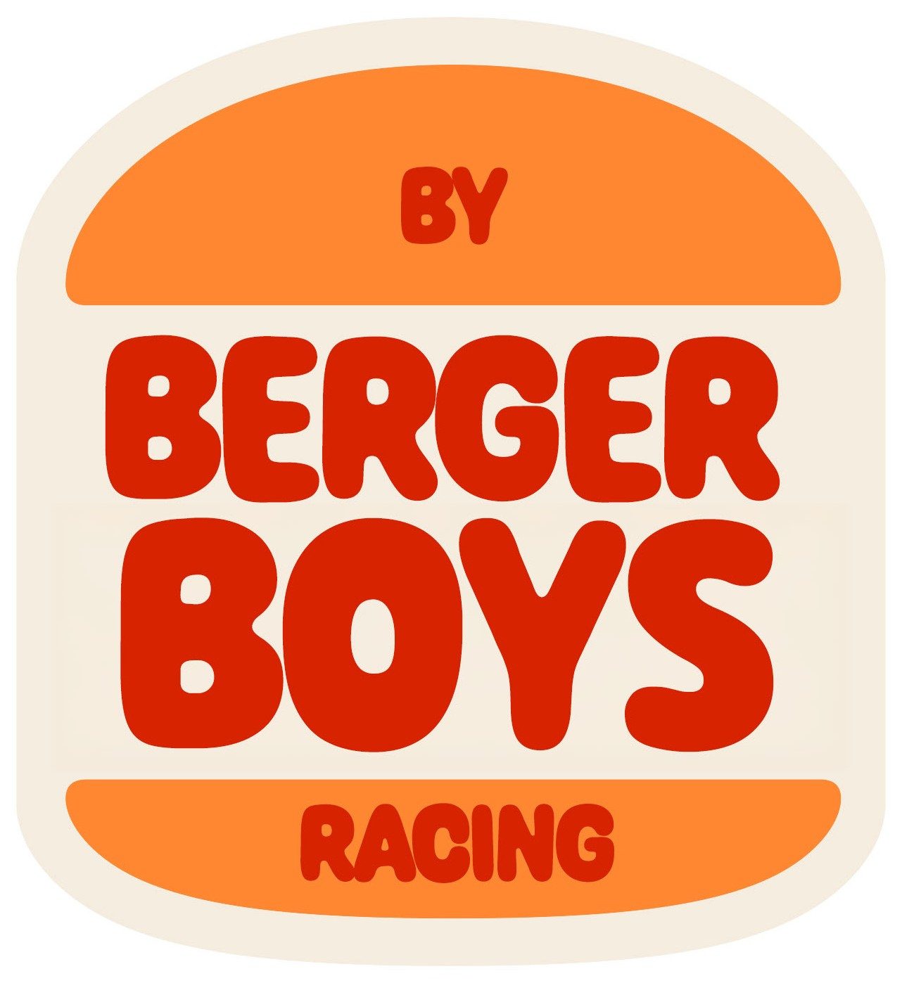
A bun. Orange, cream and red. "BY" on the top bun, "BERGER BOYS" in the middle, "RACING" on the bottom. Everyone in the family loved it immediately, which should have been the warning.
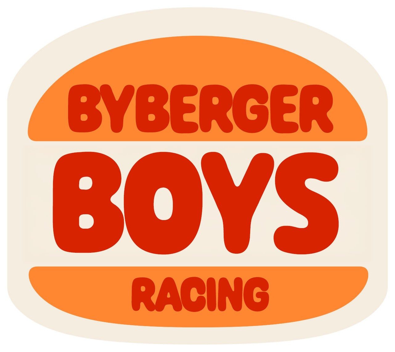
Version two tightened it up — closed the gap, squared the bun, set "BYBERGER" as one word so the pun landed faster.
The problem with a joke that good
Two things killed it, and neither was about the drawing.
The first is that it is a parody of one of the most protected trademarks on earth. That is fine on a t-shirt you make for yourself. It is not fine on a bike you are going to point at potential sponsors, on a trailer, on a business card handed to a race school. The whole reason you build a team mark is so it can go on things — and this one could not safely go on anything.
The second is subtler. A joke logo makes a promise about who you are. Ours is a family that takes the racing seriously: real leathers, real tech inspection, national rounds. A cartoon bun says "we're here for a laugh." That was the wrong signal to send to the people we were about to line up against.
The name changed before the logo did
Version three kept the bun but swapped the name to "BIG BERG RACING."
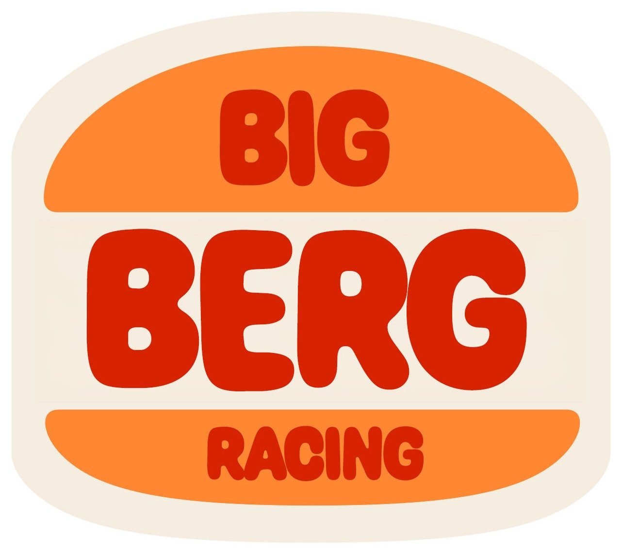
This is the version I learned the most from. It is objectively the best-drawn of the three, and it is the one that convinced me the whole direction was wrong. Once the pun was gone, the bun had no reason to exist. It was just a shape we had gotten attached to.
That happens constantly in client work. Somebody falls in love with an element early, the brief moves underneath it, and the element survives out of pure sentiment. My own family logo did exactly that to me, and I do this professionally.
The detour
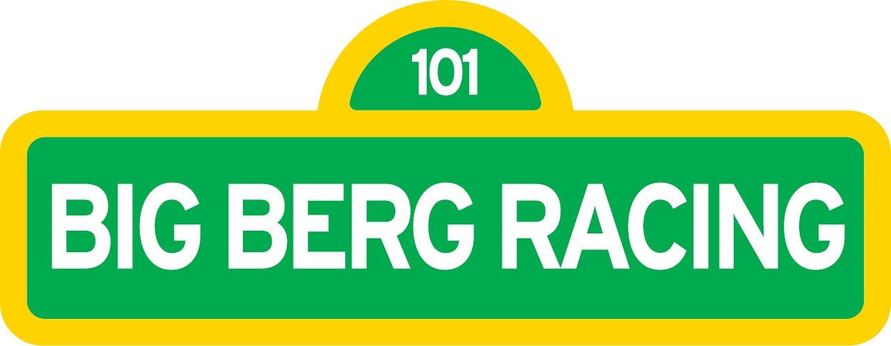
Then I went the other way entirely: a highway shield, green and yellow, route 101. Ontario roads, the long drive to the track, all of that.
It is a nice piece of design and it is nothing to do with racing. It says road trip. We are not on the road, we are on a kart circuit doing forty-eight-second laps. Wrong story, told well.
What actually worked
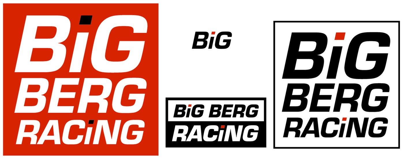
The fifth version was the one, and the reason is visible in the image: it is not a logo, it is a set.
Bold italic condensed type, a red dot on the "i" — that is the whole idea. But it is drawn as a red box version, a black-on-white version, a white-on-black version, a horizontal lockup, and a short "BiG" mark for when there is no room. That is what a race team actually needs. The number board is small. The helmet has one flat panel. The suit has a chest and two shoulders. A single logo file dies the first time you meet a curved surface.
That is the difference between a logo and an identity, and I have made a career out of explaining it to clients. I still had to make five wrong ones before I applied it to my own kids.
Version six is the one on the trailer. Black square, stacked, red dot. It reads at arm's length and it reads at 100 metres, which is the only test that matters when it is going past you on a straight.
What I'd tell a client
Make the joke version. Genuinely — get it out of your system, it is usually where the energy is and sometimes it survives.
Then ask the two questions that killed ours: can this legally go on everything it needs to go on, and does it say the true thing about who we are? If either answer is no, keep the feeling and throw away the drawing.
Six versions is not a lot for a logo. It only felt like a lot because it was for my own family, and I could not send myself an invoice for the revisions. The family suit has the same problem in leather.